Mondo artist Jock talks us through five of his most impressive posters, all of which are part of the Propstore Movie Poster Auction on March 26.
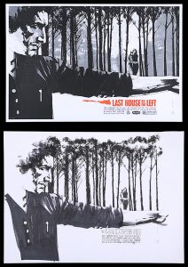
Mondo Poster with Original Preliminary Artwork, 2012, THE LAST HOUSE ON THE LEFT (1972)
The Last House on the Left
This was one of my earliest posters, and also one of the posters where the piece of art that’s up for auction is pretty much the final poster as well. In the background of the image, all the gray tone is infused with the film’s great tag line, ‘Keep repeating: it’s only a movie, it’s only a movie, it’s only a movie.’ It’s quite subtle, but if you look closely it says that all over the poster. That was one of the first times I tried to find little elements of what a film means to me and incorporate them into a design.
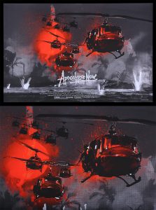
Private Commission Poster, 2015, APOCALYPSE NOW (1979)
Apocalypse Now
I was concerned that this would be too clichéd. We’ve all seen the famous Bob Peak poster with the Hueys flying across the sunset. But actually, in the end that’s one of my favorites of my posters. I just like the way it’s rendered. It has a looseness, but also strong colors. Sometimes, you know, if it ain’t broke, don’t fix it. Those elements – the sun, the Hueys, the napalm – are all you need. And if you do them in your own way, that’s what people see.
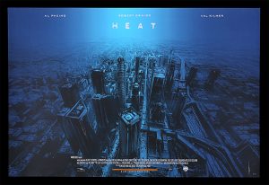
‘Private Commission’ Poster, 2018, HEAT (1995)
Heat
Heat was a private commission, like Apocalypse Now was. But originally it was another gallery that commissioned me to do it, years earlier. They were trying to push me to draw the characters in the hockey masks with guns, because I suppose if you look at my comic-book work, like The Losers, you can see why they might visualize that as a Heat poster for me. I did try some versions with the characters, and it was just lame. The image I ended up doing was the one I wanted to do all along, after I parted company with the guys who were originally commissioning me. It’s the city – which I think is the main character of that film. But if you look closely, the firefight outside the bank is all happening in the canyons of the city, very small within the image.
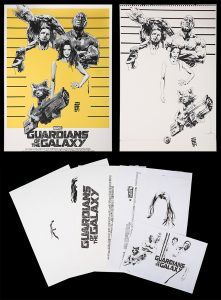
Mondo Poster with Original Preliminary Artwork, 2016, GUARDIANS OF THE GALAXY (2014)
Guardians of the Galaxy
This was an idea-led design choice. That technique of cutting out the bodies was more common in old ’50s and ’60s American magazine illustration. The goal with doing that was to elevate what would just be a drawing of the characters standing there into something that’s more design-led and more interesting.
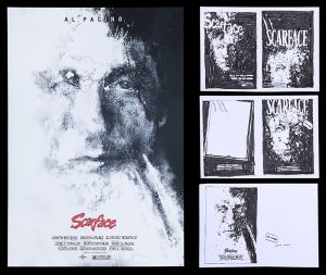
‘Private Commission’ Poster with Original Preliminary Artwork, 2018, SCARFACE (1983)
Scarface
I was approached for a private commission and asked if there was any film I’d like to do. I said, ‘I’ve got an idea for Scarface’. They said, ‘Oh, we’d like to see what you’d do with the chainsaw scene.’ And I just said, ‘I’ve got an idea for Scarface. This is it. Do you want it? [laughs] Yeah, it’s Al Pacino made out of cocaine. What more do you want?
Don’t forget to follow us on Twitter and Facebook. And remember, you can explore so much more at our archive and see the extensive range of film and TV items we have for sale and auction over at propstore.com!
